Home Blog Graphic Design Services The 2016 Rio Olympics Logo – The Story Behind Its Creation
The 2016 Rio Olympics Logo – The Story Behind Its Creation
- 12 Aug / 2016
- 2,965 views

The stage is all set. The participants are ready. The palpitation shoots up as billions of people nestle at the edge of their seats, their eyes glued to the screen, all ready to witness the most anticipated event of the year. And, it’s time for the Olympics once again!
Easily considerable as the magnum opus in sports, the 2016 Summer Olympics is being hosted in Rio de Janerio, Brazil. Amid all the furore surrounding the quadrennial affair, people often tend to overlook the most exquisite part – the logo. 2016 has marked the creation of one of the most spectacular logo designs in the history of the Olympics. In fact, it has become the inspiration for the professionals at any logo design company India till date.
In order to get everything done on time, the Olympic design committee had decided to outsource the work of logo design to different firms from across the world. The journey from conceiving the design to putting it out in front of the entire world required extremely meticulous work, a commendable level of determination and copious amounts of trail and error.
It was undoubtedly a torturous path for Tátil, the people behind the logo. Lots of heated debates, contrasting opinions and rigorous brainstorming led to their victory from among 138 other design firms competing against them. Ever since the announcement, the creative director at Tátil, Frederico Gelli, started working with his team to create something worthwhile.
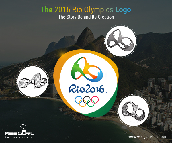
Gelli says that the idea for the logo was derived from the mountains of Rio, with all the curves of the logo bearing a striking semblance to those of the mountains. Gelli got the initial inspiration while he was swimming near the Ipanema beach, where the harmonious structure of the Dois Irmãos (Two Brother Hill) caught his eye. It instantly struck him how the concept of unity could be incorporated into the design – something that every culture around the world could relate to. His aim was to create a design, not as a designer, but as a common citizen of Brazil.
There is more to the logo than what meets the eyes. It depicts the union between three human beings, each with its own representation. Going to the root of the ‘Infinity’ design, Gelli opinionate that the essence lies in the Carioca (a term used to define anything related to the city of Rio) souls. Just like Brazil has a harmonious culture born out of different ethnicities, the logo depicts three people joining together, as in the case of the Olympics, where people from all over the world come together to showcase their talents.
The three colors in the logo also have their own interpretations. Tátil decided to incorporate the Brazilian charm into the logo with the color scheme. The Yellow symbolizes the sun and the warm, vivacious nature of the Brazilians. The Blue depicts their easygoing nature like the waters that surround Brazil, while the Green stands for their nature to go forward with positivity, and also the Tijuca forest.
It was a winning moment for Tátil when they were informed about their logo being selected. But at the same time, they were hit with an NDA that prevented them from disclosing the design to the public. During those four months, maintaining secrecy was of paramount importance. It went to such an extent that they had to cordon off an area in their office and only 10 members of the firm were made aware of it. The section was only accessible via fingerprint scanning and everyone else was told about a fake secret project they had been doing. Irrespective of the challenges Tátil faced throughout and the difficulties they had to overcome, their efforts literally emerged with flying colors.
2 comments
Leave a Reply

-
1000+
Happy
Clients -
25+
Countries
Served -
19+
Years of
Trust


Wow! I didn’t know about this story. Hats off to the creators. Great logo! And great article by the way. Thank you for enlightening us.
I really love how the designers have related the environment of Brazil to the logo, keeping the vibrance intact. It sure took a lot of effort but at the end of the day, it was totally worth it. Kudos to the designers and to you for highlighting their efforts.