Home Blog Web Application Development 5 Must Have Elements in a Modern Dynamic Website Design
5 Must Have Elements in a Modern Dynamic Website Design
- 15 May / 2020
- 8,728 views
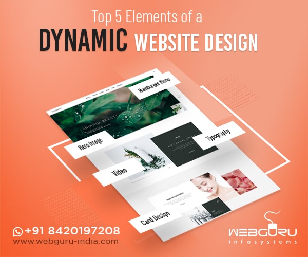
With new trends continually emerging, website design can never be static. You may have designed a state-of-the-art website a decade ago but that’s completely obsolete now. With time, you need to regularly upgrade your website to impress your audience.
But once you search for the latest website design trends, you will be flooded with numerous search results. It’s confusing to determine which ones to follow. We are here to help you narrow down the focus.
Here are some elements that must be present in any modern dynamic website design. Incorporated thoughtfully, these elements wonderfully explain your company, deliver excellent user experience, and produce a positive brand image.
Essential Design Elements on Your Website – A Guideline by Website Design Company
1. Unique, Common, and Large Sized Typography
Typography is one of the most crucial elements of any website. We will discuss three aspects of typography – uniqueness, size, and availability.
Let’s first talk about uniqueness. Most companies prefer to have a particular typography or font that they use across their services or product range to help the customers easily identify them among the competitors. Even if they engage professional companies offering digital marketing services, they ensure that all types of advertisement campaigns maintain the same typography. Having a custom font is indeed a cool practice. And thanks to the experiments of professional web designers, a wide range of fonts are available to choose from.
Now comes the matter of size. According to a study by the NNGroup, on an average, people spend about 10 seconds on a web page. So, you need to clearly communicate your value proposition within this stipulated time to retain their attention for a few more minutes.
Large fonts have a crucial role to play in this. If people face difficulties in comprehending the content on a website, they will bounce within a few seconds. Remember, competition is quite steep and an increased bounce rate is never intended. This is more significant if you own an eCommerce website. That’s why we recommend you to engage the professionals at any leading eCommerce website design company who can assist you in selecting the right font for your site.
Last but not the least, typography also reveals the nature of your company. Are you serious or fun? Informational or functional? Also, make sure that the typography you choose is compatible across devices, operating systems, and browsers. Further, you need to ensure that the font looks cool both on a billboard and a small banner ad once you engage any efficient digital marketing agency India to market your products/services. You surely don’t want to sacrifice adaptability for uniqueness!
2. Embed Video to Enhance Reliability
Including a stunning video on your website can instantly change its outlook. Also, it significantly reduces the necessity of the presence of other content.
Instead of reading a bunch of paragraphs, the audience can get a wholesome idea about your business from the video. You may be knowing that the human brain can process moving images 60,000 times faster than a text. Naturally, a video can explain your business, products, and services in an engaging manner. Further, a real-time product video adds more to your brand credibility.
Now, before embedding a video on your website, bear the following aspects in mind:
- The video should not start automatically just when a visitor enters your website. And of course, it should not cover the entire screen of the mobile device. That may overwhelm the attention of the people allowing them to bounce.Also, many people browse websites, especially eCommerce sites while at work. If a product video automatically starts at a high volume, it can irritate the users and lead them irritated. So, the expert eCommerce website development professionals recommend to incorporate a play button in the video and leave greater control to the audience.
- Including a high-pixel video on a website often weighs it down. So, it’s better to engage website design experts to balance the loading time and state-of-the-art site design.
3. Responsive Hero Images to Attract Audience
The hero image is a large banner image that is prominently placed on any web page. The professionals at any website design company have noted that such an image can instantly draw public attention and encourage them to scroll down.
A hero image is usually placed in the background with text overlaid on its top. It enhances visual experience wherein you can tell your story without relying solely on the text. However, you need to bear the following three points in mind:
- Make sure the design is responsive and anyone exploring your site via desktop, tablet, or mobile phone can easily see the same picture. So, scalability is an important element while placing a hero image. You may engage a custom website design services to ensure image adaptability.
- Select the colour of the overlapping text very carefully so as not to affect the readability. For starters, a light-coloured text suits well on a dark-coloured background image and vice versa.
- Try not to strain the users’ eyes with a clumsy picture and too much of overlapping text. Maintain spacing to create an optimum balance between the image and the text.
4. Hamburger Menu
Every little element in a website carries immense significance. But sometimes we tend to overlook some or don’t really acknowledge their significance. The hamburger menu is one such item. You may have noticed three horizontal lines on several websites that open the menu bar. This is called a hamburger menu.
A website may have multiple web pages and displaying all options on the homepage can take up a lot of valuable screen space. The problem gets messier for people accessing the site from mobile devices, which already have a small display.
The hidden or hamburger menu can be a rescuer in any website or web application development.
Such an intuitive website element improves site navigation and keeps the audience distraction-free. So, make sure to include this item during any eCommerce website development.
Interesting note: Do you know why these three horizontal lines are called hamburger menu? Because the three lines are stacked one upon the other and look like hamburger patties! Imagination is a curious thing, you see!
5. Try Card Design
With the rising popularity of Pinterest, designers have become fascinated with the card design. Individual cards help to distribute information visually so that visitors can consume information without being overwhelmed.
Card design is increasingly becoming popular across B2B and B2C websites. Other than making the website attractive, cards also help in presenting information in an organized manner. Using this design on the site may help in highlighting multiple solutions or products side-by-side. Also, by breaking up several pieces of content into cards, users can easily select which articles they want to expand.
Card design can be an integral part of eCommerce web development. Just bear in mind that the cards should be responsive. This means that once the screen size gets larger or smaller, the number or size of the cards in a row should also adapt accordingly. Also, there should be some white space between two cards so that the design doesn’t look clumsy.
Conclusion
Are you wondering if the website design price will be hiked after incorporating such varied elements? You can always check with us to learn about the approximate price. Consider this to be an important investment as the image of your business relies on this.
Hope you’ve found our article useful. Comment below and share your thoughts with us.
10 comments
Leave a Reply

-
1000+
Happy
Clients -
25+
Countries
Served -
19+
Years of
Trust






Nice post.
It was a very useful blogs that u gave to us ! i really found what am looking for Keep updating more. Thanks for sharing this informative article. its very helpful for me. thank you.
The information you give in the blog is very good.
tt was very useful information.
You provided us with a blog that was quite helpful. I actually eventually found what I was searching for. I thank you providing this useful article. It is quite beneficial to me.
Fantastic blog!!! The top SEO services have been on my search list. Thank you for creating such an interesting site; it has helped me with a lot of questions.
Essential elements of dynamic website Adapting to different devices and resolutions, offering good user experience, minimizing loading times and providing a smooth browsing experience can be considered as some of the few essential elements of dynamic website.
Fantastic blog!!!Thank you for creating such an interesting site; it has helped me with a lot of questions.