Home Blog Graphic Design Services Brochure Design Best Practice: Tips and Tricks
Brochure Design Best Practice: Tips and Tricks
- 11 Aug / 2010
- 3,505 views
Brochure design is a powerful offline marketing tool that can give a huge fillip to a marketing campaign if it can be employed properly. As it represents the brand image of an organization, you need to make it look as impressive as possible. It should have a clean structure and should not include a wide array of graphic elements just for sake of giving it a different look. The purpose of designing a brochure is to establish a visual combination with the visitors through the use of images, text and symbols. Since it is a compilation of a number of different graphical elements, you need to be a little careful while designing a corporate brochure or professional brochure. Here we are going to forewarn you from some practice that can have serious impacts on the designing process:
Keep It Simple: This is the bottom-line of brochure design. You need to master the art of keeping a design simple. It may sound easy enough but it might appear nerve-wracking. Keeping a design simple yet interesting is the most difficult job since you will not have many options in hand. You need to reply on your designing skills.
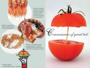
Try Different Alignments: – A rare visual twist can be given to a brochure by using different alignment in different pages. However, you should not try out this half-heartedly because the result can be disastrous. You need to sketch out a plan before making a stride further in that direction and if possible try to gather some strength by checking out the designs of other famous brochure designers.

Do Not Make Them Squeeze: – Brochure should have a pleasing look. You not squeeze content in between the images or should not cram it by adding a number of different graphical elements. You need to understand the fact that brochure designing is not all about positing graphical elements; rather it is all about aligning elements judiciously. Try to keep a balance in the structure as far as possible if you want to seize the attention of your viewers.
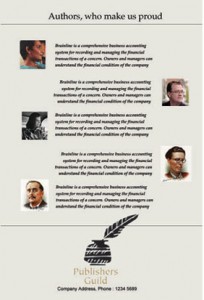
Do Not Use one Color: – There is no point of designing a website in just one color. You can make your brochure look good and impressive by adding different varieties of colors. However, you should not use bright color profusely. You should try them out as sparingly as possible.
Use of Fonts: – Shun use of wacky fonts as far as possible because people might hard to go through them. Try some common fonts such as Ariel, Georgia or something of that clan so that your brochure appears attractive as well as readable.
Make It Unique: – This is what you should give utmost priority. The design of the brochure has to be unique because cheap imitation cannot play constructive role in enhancing the brand and public image of an organization.
5 comments
Leave a Reply

-
1000+
Happy
Clients -
25+
Countries
Served -
19+
Years of
Trust






Many small businesses consider brochures as great tools that can help them become household names but sadly this is not always the case. The real goal to a brochure is to validate that a company is serious, it usually isn’t going to be the piece of marketing that will close the deal for you. Its simply a form of marketing that assures the prospect that your are “serious” about your business.
Flat pack of banalities, this article, all consisting of “priceless” tips and tricks like “Keeping a design simple yet interesting is the most difficult job since you will not have many options in hand. You need to reply on your designing skills.” Rather disappointing for one claiming themselves a webguru.
Amazing information on this website. Thank you for sharing.
Great article. Thanks for sharing your helpful tips about brochure design. Very informative.
Great tips on creating effective brochure designs! The emphasis on simplicity and unique elements is spot on for making a lasting impression.