Home Blog Graphic Design Services How to Design the Perfect Brochure: Effective Tips
How to Design the Perfect Brochure: Effective Tips
- 04 Aug / 2021
- 4,294 views
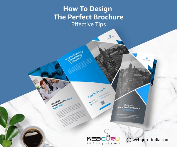
Simply put, a brochure is a visual marketing tool that showcases an organization’s services and products. It can give you an edge over your competitors and help you stay ahead of the curve. Brochure design is not completely limited to the images or layout that you want to use. Rather, it is a combination of elements working together in harmony that makes sure your brochure evokes reliability and trustworthiness. Elements like the font, the content, and even the type of paper on which your brochure is printed need to be taken into consideration during the planning stage.
Identifying the objectives and the target market are some of the first steps to handle some of the obstacles that may come along the way. So, how exactly do you design an awesome brochure? Well, by the end of this blog, you’ll have a clear insight into how to design an effective and unique brochure that creates a long-lasting impact on your target audience.
Perfect Ways to Design an Effective Brochure
1. Analyse the Objective
The first and foremost step is to decide on the central purpose of your brochure. Do you want to promote a particular service? Sell a new product? Showcase your best offers?
Putting in the time to plan out your brochure will not only save you from wasting time and money but will also help you to determine the amount of content that the brochure will include. Being clear about your objective and the message that you want to convey in your brochure will help your customers understand exactly what you have to offer.
2. Define your Target Audience
When designing your brochure, think of the intended audience and figure out what information they are looking for. If it is to promote a sale, it needs to be visually appealing. Alternatively, if the brochure is designed to provide technical information, it needs to be carefully detailed.
For instance, a brochure for the summer camp of a middle school is directed at both potential students and their parents. Whereas, a brochure for a Master’s degree program will be directed at people who are already graduated and matured.
3. Brochure Fold
You might think “Well, isn’t there just one brochure-type… you know, like a brochure?” The answer is a big NO! When it comes to brochure folds, choose a type that matches your industry and best fits your campaign. Some of the most popular types include bi-fold, Z-fold, roll fold, Single/double gate fold, etc.
Make sure the fold complements the type of content you include in the brochure and the way your target audience reads it. You may also engage professional brochure design services to get a creative and feature-rich brochure.
4. Copywriting
An effective brochure copywriting communicates information. Make sure that the content mentioned in the brochure is in line with what your target readers want to read. Also, it’s important is understand that too much text is not a good idea in a brochure. You can use headers, brief paragraphs, and short sentences to make it more appealing to the clients.
5. Perfect Fonts
Fonts determine the readability of your text, sets the tone of your brochure, and enhances its visual appeal. Incorporating too many fonts in your brochure makes it look messy and unprofessional. That’s the reason why the professionals of brand identity design services recommend using one or two variations. However, you need to make sure it blends with the style of the rest of your design elements as well as the brand image.
One more thing, take into consideration the font size you are using. You definitely wouldn’t want to select something that’s too big to blind the readers or something that’s too small to strain the eyes.
6. Call-To-Action
Arguably, the call-to-action is the most important section of your brochure. This is the part where you lead your readers to an intended action and gets you closer to accomplishing your goal.
Make sure not to bury the CTA in a pile of text. You can use visual cues like a different font, colour, or larger white space around it to make it stand out and grab the readers’ attention. You can also incorporate the following contact information in your brochure:
- Website
- Address
- Social Media Accounts
- Phone Number
7. Type of Paper
If you want to make a great impression and promote a distinct corporate identity, be a little careful with the quality of the paper you are going to use. For more customers, your choice of paper can influence their perception of your company.
Paper that is a bit heavier will make the brochure look sturdier and also have better durability. It may be a bit costlier than regular ones, but it will show that you care for your brand and made an effort for your readers.
8. Fascinating Graphics
Intriguing visual elements can be a perfect way to communicate with your target readers. You just have to use compelling illustrations to convey the story. Incorporating such high-quality elements in a brochure ensures that the readers feel the urge to pick it up and read every single word. However, it’s important to choose suitable pictures connected with the theme of your business. So, choose wisely!
Final Thoughts
Now that you have learned all the best ways to create an effective brochure, there’s no excuse not to. A good design will drive readers to read all the content on the brochure. On the other hand, a less-than-stellar design may end up in the dustbin. So, to make sure you get the best results, engage a professional brochure design company. Starting from conceptualization to the actual design of the brochures, the experts will take care of everything.

Soumi Bhattacharya
Soumi Bhattacharya is an experienced content developer & keen observer of all things digital. Analyzing the latest trends in technology is her forte.
3 comments
Leave a Reply

-
1000+
Happy
Clients -
25+
Countries
Served -
20+
Years of
Trust




Nice post
Nice Blog…. This is really amazing. Great information about Brochure Design.
This is a great breakdown of the steps to design an effective brochure! I never thought about how the fold type could affect the message – that’s a clever tip.
The call to action (CTA) point is super important too – gotta tell people what you want them to do next!
This blog is bookmarked for next time I need to design a brochure. Thanks for sharing!