Home Blog Graphic Design Services Similar Logos But Different Companies: A Perfect Logo Design Dilemma
Similar Logos But Different Companies: A Perfect Logo Design Dilemma
- 24 Sep / 2010
- 9,021 views
Picture yourself on a bright Sunday morning with a cup of hot black coffee and morning newspaper. You are perfectly at ease with yourself and then you find someone who resembles you. He is your look-alike. You will certainly feel a cold shiver down your spine. The same goes true with the leading corporate organizations when they find with utter surprise that their logos look almost the same with that of another organization. Apart from the legal intricacies, you cannot overlook its negative impact on their brand value. Can you dare to flaunt a logo that resembles Google or Yahoo? We suppose not.
Obviously there are cases of sheer co-incidents and sometimes the reasons are quite obviously (I do not want to rub on this point anymore). Here in this article, we are going to explore some interesting logos that look like twins but they are not. Let us take a look:
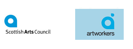
Scottish Arts Council and Artworkers
 The uncanny similarities between these two logos can go down to the history of logo design since we have never seen any other logos flaunting almost the same form and structure. Furthermore, the fonts and the positioning of the texts are almost similar. The only difference is that artwork has positioned an extra element just above its main logo.
Sun Microsystems and Columbia Sportswear
 It is really hard to believe that two companies of two different sectors can proudly flaunt almost the same logo. However there are some marked differences exist between them for example, Columbia Sportswear is featuring a basket like logo by positioning equal sign (=) squarely. Moreover, it is also using a different color scheme for its logo. Sun Microsystems is using a business-like blue whereas Columbia Sportswear has kept its faith in earthly brown color that goes perfectly with its sport portfolio. There is another marked different exists. Both the companies are using different fonts.
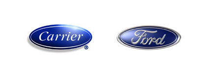
Carrier and Ford
 Once upon a time, Carrier used to feature a logo that looks almost similar with that of the Ford’s logo. But thankfully, they have now opted for a different logo that truly represents what they are. Ford on the other hand is having a great time with its old and famed logo.
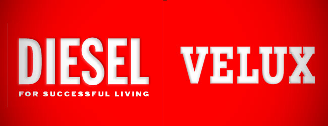
Diesel and Velux

Logos of these two familiar brands have one thing in common and that is the red background. But is that all that make them so similar? We suppose not. Besides using the iconic and bloody red background, which stands out of the rest of other the elements of their websites, both of these two logos are extremely simple and the messages are quite clear. They are straightforward, aggressive, bright but serious in their approach. But the question is how can one apply the same approach and the same rules while designing logos for two different companies.
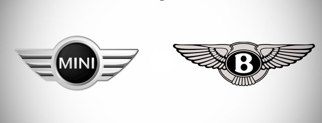
Mini and Bentley

These two logos are more or less the same. However, they have reasons to be same since both of them are into the automobile industry. Both of them have used wings to connote speed and movement. Even the color scheme is the same but the structure is slightly different. Mini logo is a bit advance as far as its overall structure and appearance is concerned whereas Bentley believes in its traditional look.
5 comments
Leave a Reply

-
1000+
Happy
Clients -
25+
Countries
Served -
19+
Years of
Trust


Don’t forget that the Sun logo contains the word “SUN” four times!
Thats gr8…I never noticed before that
Wow!!! Great article. These logos are very much similar to each other. Thanks for compiling. Keep it up.
its realy interesting
Very great post. I simply stumbled upon your blog and wished to say that I’ve truly loved browsing your weblog posts.
In any case I will be subscribing in your feed and I hope you
write again soon!