Home Blog Website Design Services Transparency in Website Design: Rules, Examples and Best Samples
Transparency in Website Design: Rules, Examples and Best Samples
- 16 Nov / 2010
- 3,126 views
The use of transparency in the sphere of website design is not anything new given the fact that website designers are always striving hard to experiment with the look and feel of the website to make the final product look different as far as possible. Though transparency can make a website look unique and amazing, if you fail to employ it correctly, things can take a serious turn. Even experienced website designers take extra precautions while designing a website based on transparency. Here in this article, we are going to showcase some of the websites that are interlaced with transparency:
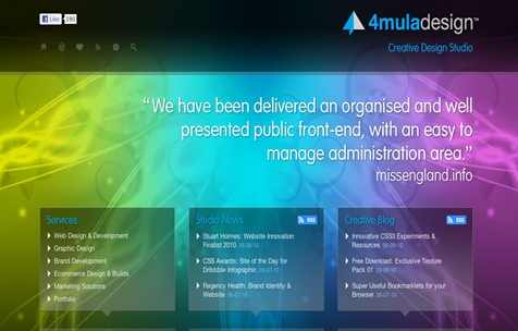
4mula Design: – Here in this website, the designer has focused fully on transparency and the use of bright colors has heightened the impacts precisely. Though content is used, the focus is solely on the style. Navigation is not easy and novice users might have to face some troubles. Other than this, it looks good and promising.

Christine Galvin: – This website looks stunningly beautiful because of the extreme level of simplicity. Navigation is quite easy and the first timers are not likely to face any trouble while browsing this website. It has a bit of everything in it. Designer has done a commendable job by fusing two opposing polarities beauty and brains successfully.
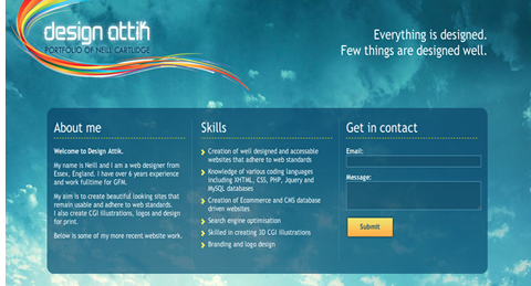
Design Attik: – This website is a brilliant example of how a single page website should look like. About Me, contact us and rest of the important sections are placed prominently at the fore and the impact is truly amazing. Though the transparency level is not high, it creates a unique effect that you can hardly overlook.

Lift UX: – This website focuses mainly on the use of dark colors. The use of dark and light color creates a unique level of contrast that will definitely seize the attention of the readers. Message of the website is quite clear and it has almost everything that a website should need to grab the attention of the readers.
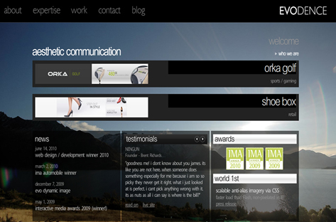
Evodence: – This website employs a cleaver variation of light and dark colors and the outcome is enriching and truly unique. However, reading the text is a tough nut to crack.
2 comments
Leave a Reply

-
1000+
Happy
Clients -
25+
Countries
Served -
19+
Years of
Trust


nice colorful blog… superb classic design…..
Some good examples there, here is another one sky1.sky.com/lost. They use Transparency a lot, but don’t look at the text for too long, it make my head hurt!