Home Blog Website Design Services Travel Website Design Inspirations and Examples For Website Designers
Travel Website Design Inspirations and Examples For Website Designers
- 22 Dec / 2010
- 3,848 views
Designing a travel website may take some doing, as you will have to present something interesting in an engaging way otherwise, people would not care a fig to explore that website. Moreover, you need to make sure that the details are easily accessible, images are of good quality and the website looks professional, otherwise you might find it really hard to hit the bull’s eye. The outcome should look refreshing, impressive and should have an enticing appearance, if you wish to woo your targeted audience. Since people surf travel websites for gathering information about culture, climate, facilities, reservation, restaurants, memorable places, special events etc of a particular place, you need to present them all in a compact form. Here we have included some of the best travel website design samples that will help you come to term with the latest trends in this sphere:
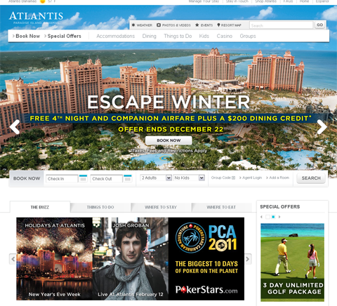
Atlantis.com: – It is a complete package, as this website comes loaded with almost everything that a traveler needs before setting off. Atlantis looks highly impressive with large images and its top horizontal menu is quite easy to locate. Located on the left panel is a section for special offers. Visitors can easily find interesting information such as “Where to stay”, “Where to Eat”, “Things to do” etc.
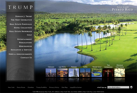
Trump.com: – It is a flash-based travel website and here the focus is primarily on grabbing the attention of the viewers. Navigation is simple but it has a touch of innovation. At the bottom of the page, you can locate clickable images of some popular cities.
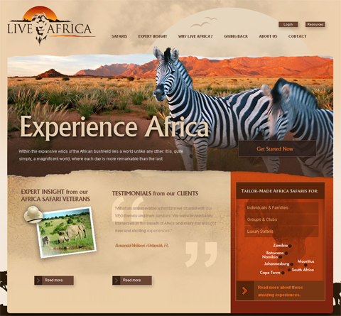
Liveafrica.com: – Liveafrica presents the charm and beauty of Africa without cramming up the site with loads of images or graphics. Sparing use of images and proper placement of text has helped this website to stand tall in the crowd.
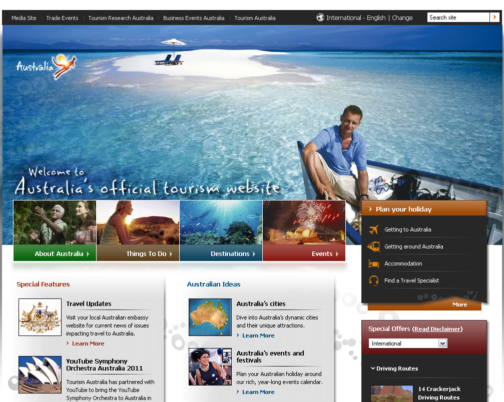
Australia.com: – This website is a true showstopper. It steals the show with its brilliant color combination. Its navigation system may appear a bit out of the box but a novice user is not likely to face any trouble while browsing this website.
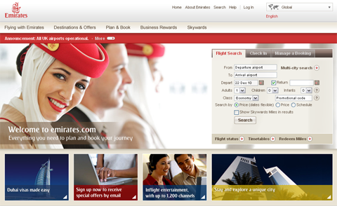
Emirates.com/English: – It is one of the most popular websites among travelers. You can book flight, manage booking, check out latest offers and can do other things without facing a single hassle. Its interface is utterly simple.
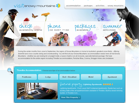
Visitsnowymountains.com.au: – This is another refreshing and colorful example of travel website design. It comes with a lively background. Navigation is simple and there is a riot of colors that gives it a distinct appeal.
2 comments
Leave a Reply

-
1000+
Happy
Clients -
25+
Countries
Served -
19+
Years of
Trust


Very nice websites. My favorite? Live Africa !
What’s up, its pleasant article about media print, we all understand media is a impressive source of information.