Home Blog Website Design Services Website Design – The User’s Perspective
Website Design – The User’s Perspective
- 16 Dec / 2015
- 5,998 views

The success of any tangible or intangible product is defined by its utility and usability. Likewise, it is for custom website design services as well. The user of the website is the only person who clicks on the mouse and interacts with it. So, it is really important to understand the user’s point of view and their behavior. Grand designs and rich functionality serve no purpose, if a visitor does not understand easily how to get from one point to the other. For a professional, usable design, following the basic rules of website usability along with common sense creates the magic.
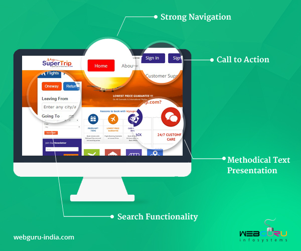
The main usability components to enhance user experience should offer:
- A self explanatory, simple navigation
- Methodical and scrupulous text presentation
- A search functionality avoiding the ‘No Matches found’ result page
- A well thought out, visible site structure
In order to implement the above principles, we need to understand how users prefer to interact with a website and what their thinking is.
- Users like quality and appreciate credibility: They know it when they see it. Users when browsing the web are actually looking for something and since they bumped into your site, probably you are relevant to their search interest. Users like high quality content. For this, they can compromise with the design or the disturbing ads as well. Content is always of utmost importance.
- Users scan before they read: The phaonmneal pweor of the hmuan mnid, aoccdrnig to a rscheearch at Cmabrigde Uinervtisy – the huamn mnid deos not raed ervey lteter by istlef, but the wrod as a wlohe. The same holds true when they go through a website. They do not inspect every nook and corner of the website, rather they are affected by the overall presentation of the page. The human eye is a very non linear device which can instantly recognize patterns and motions. Hence, it is very important that the components of the page should be proportional in size. One should not overshadow the other. A point to remember is the readability of the text and its associated image. Both should complement each other rather than compete with each other.
- Online users are very impatient and they need immediate answers: They look for some anchors or links which would redirect them to the required section. The higher the cognitive stress, lesser will be the urge to navigate and more the users will think of looking for an alternative website. Fair enough that your website may not cater to the need of every user in the world, but the focus here is to make the website so user friendly that at least the user feels like going through the contents of the site.
- User like to have all the control: There are a bunch of websites which require entering the email before the user can even view the homepage. While it is basically a marketing strategy for gathering leads, it also runs an equal chance of the user leaving the website forever. Hence, allow the user to close the pop-up and continue. The user will sign up if interested otherwise the lead you gathered by force is not worth following. Users like to have control of what they want to see and what information they want to provide.
Conclusion
In this article, we have focused on the user’s expectations of a website. Keep visiting our website’s blog where in our next article, we will come up with the principles implemented for achieving an effective usability.
6 comments
Leave a Reply

-
1000+
Happy
Clients -
25+
Countries
Served -
20+
Years of
Trust


Designing a website keeping users’ perspectives in mind can significantly contribute to its utility and usability.
Great post..
Thanks for sharing.
Companies understand the importance of having a user-centric website. Your blog explains the perspective of users clearly. Well done!
Great write-up! Thanks for sharing the basic rules of website usability together with user’s perspective.
Thanks for your comments.
Reading the mind of the users is very tricky. There is no rule of thumb. It varies from business to business. Experience and good research is the key.