Home Blog Website Design Services Website Header Design: Latest Trends and Examples To Get Inspired
Website Header Design: Latest Trends and Examples To Get Inspired
- 27 Dec / 2010
- 3,861 views
Website header is arguably the most vital part of a website, as it is the section that receives maximum attention of the visitors. As is obvious, it has to look good and impressive. But if you have ever been into this creative field, you know it very well how difficult it is to make a website header stand out. Sometimes, you just run out of ideas and sometimes, you will struggle frantically to get some inspirations. Here in this article, we are going to feature some unique and trendy website headers that will hopefully spark ideas for your next website design project:
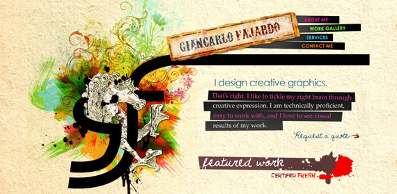
Giancarlo-Fajardo.com: – This website features a large header that goes perfectly with its overall theme. It looks exciting and has enough ingredients in it to make you feel inspired.
![]()
Pixel Cool: – This is another example of colorful website header design. Every pixel of this header looks great and the designer has done a thundering good job by placing bright colors against a dark background cleverly and astutely.
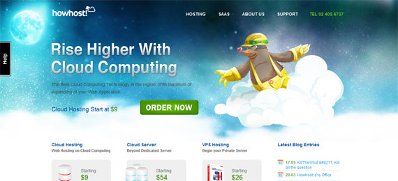
Howhost.com: – It is the brilliant blending of bright and dark colors that adds flavor to this website. It is interesting to note that here prominence is not given on the logo, rather it is the header that steals the show.

Sietedefebrero.com: – This is an example of clean and simple website header. It looks great with simple and sober color combination.

Hugsformonsters.com: – This header looks stunning and the designer has tried something different. It is large but at the same time, it looks nice and pleasing to the eye. Its artistic appeal is something that few of us can ignore.
Latest Header Design Trends
Big is Better: – Small header has already become passé as designers are finding it comfortable to work with large header, as it gives them the opportunity to experiment.
Different: – Designers are trying to break new ground to churn out something interesting. They are fusing different techniques, color combinations etc and the results are satisfying so far.
Fonts: – Designers are using fancy fonts to seize the attention of the viewers. Headers are coming with extra large and wacky fonts to deliver message of an organization precisely to its targeted audience.

-
1000+
Happy
Clients -
25+
Countries
Served -
19+
Years of
Trust

